

PT/BR
ONNE é uma empresa de São Paulo há 20 anos no mercado com seu foco principal sendo a prestação de serviços especializados em TI.
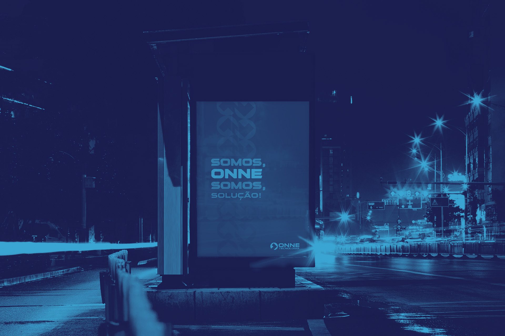
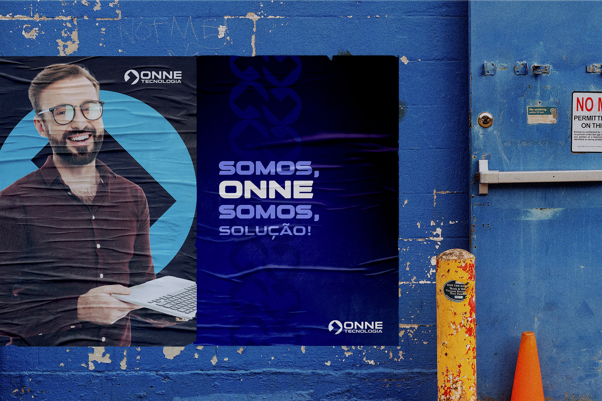
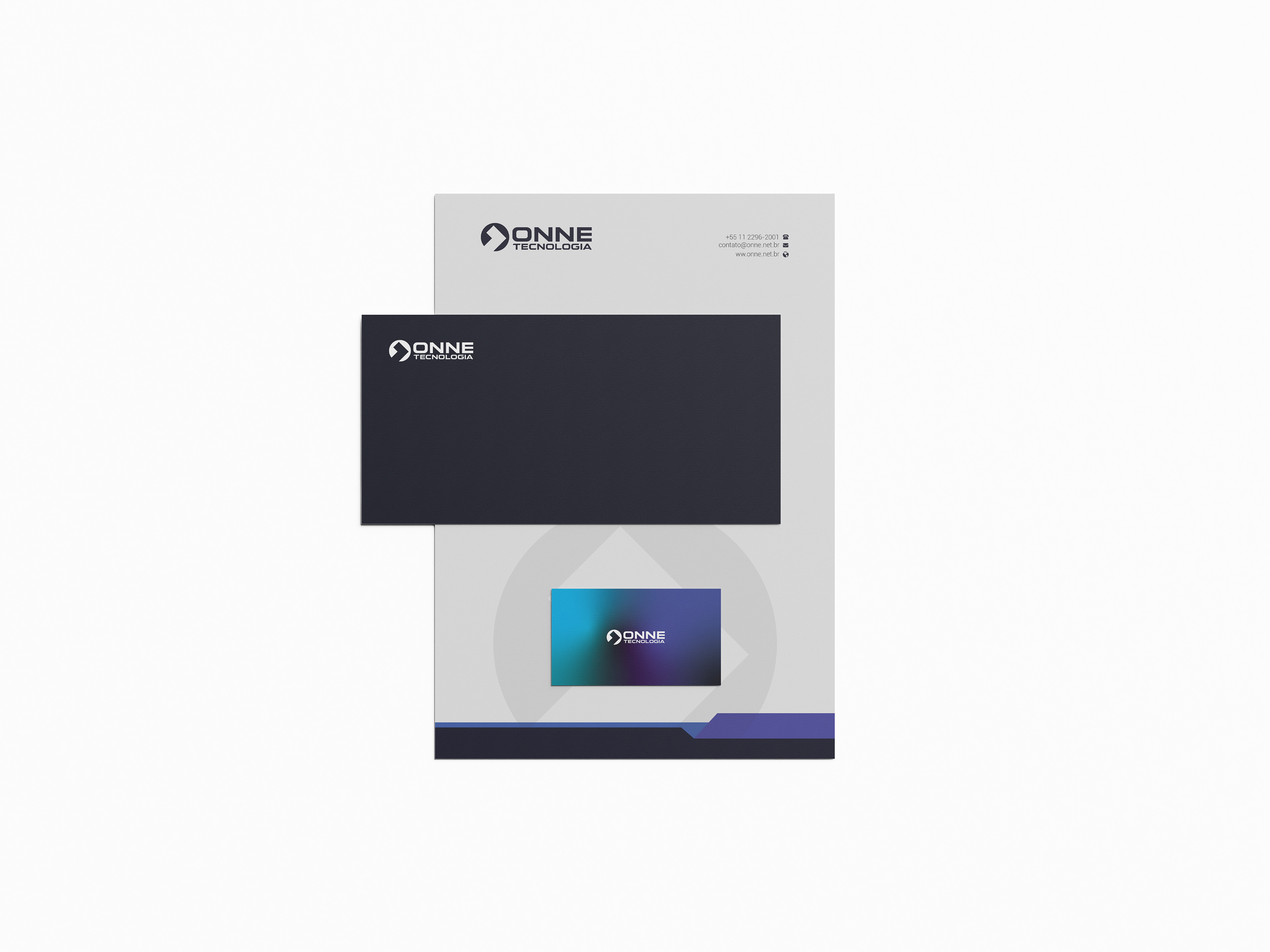
A nova marca traz uma referência da identidade, atual, mais nítida com mais força e potência nas cores, e no nome, com uma tipografia mais neutra otimizada para leitura.
O ícone foi pensando em um elemento da linguagem de programação e ao mesmo tempo no número 1 de ONNE (o elemento usado foi o ">" símbolo que representa "maior que" trazendo o significado da importância da segurança que a empresa tem com os clientes, que colocam eles em primeiro lugar e por isso são os maiores quando se trata de atendimento e entrega de trabalho. Um implante para lembrar que quanto mais você precisa, maior será o apoio, sendo número 1 em atendimento. Um resumo de como a ONNE traz o que cliente precisa, sendo bons no que fazem.
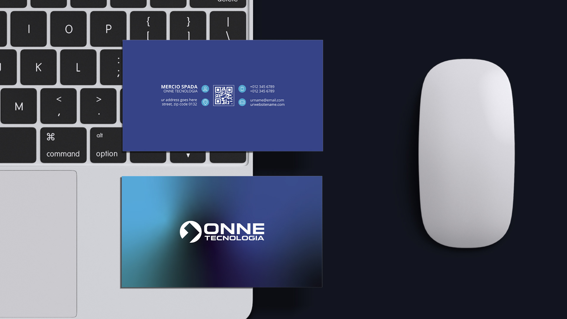
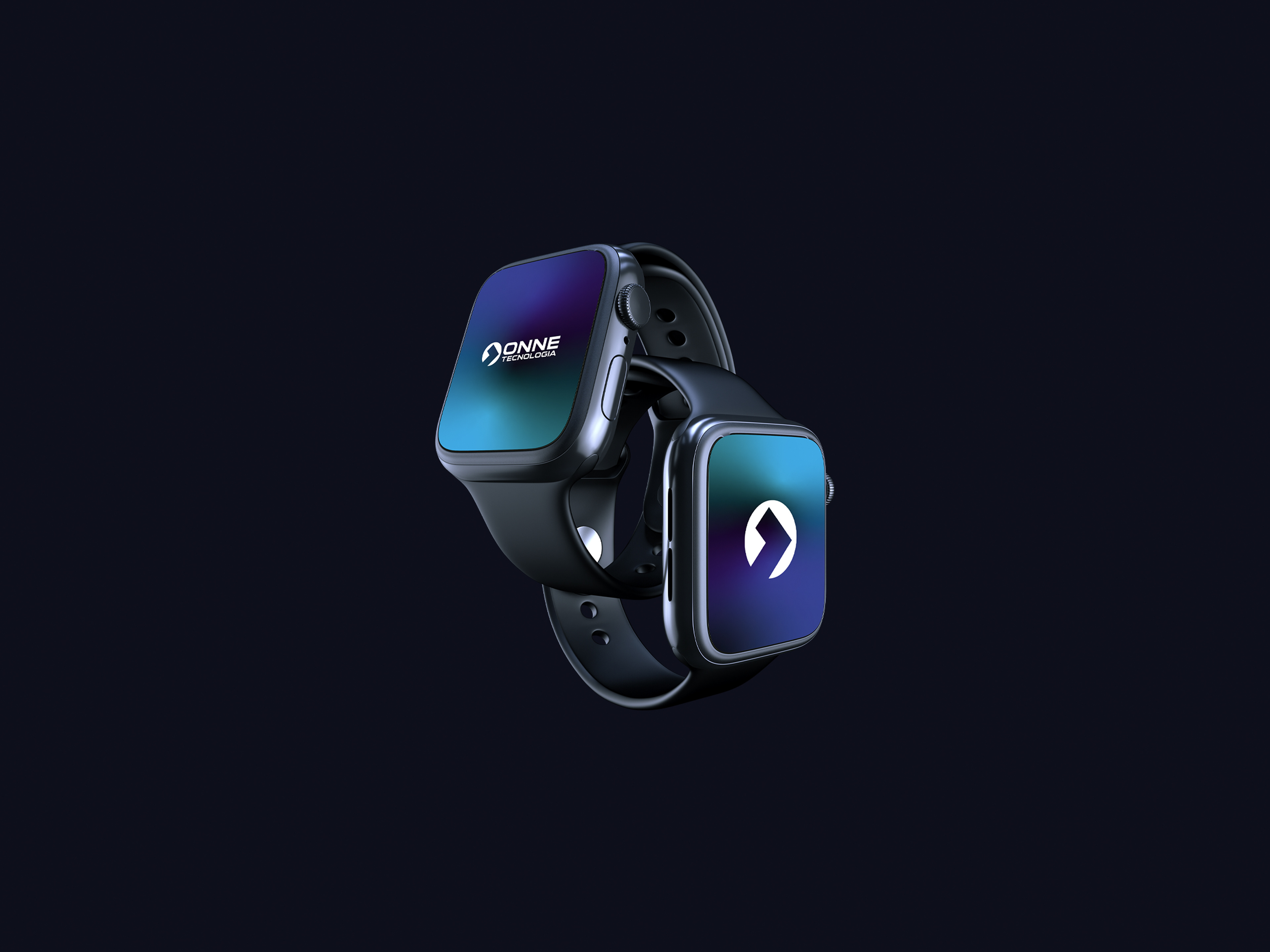
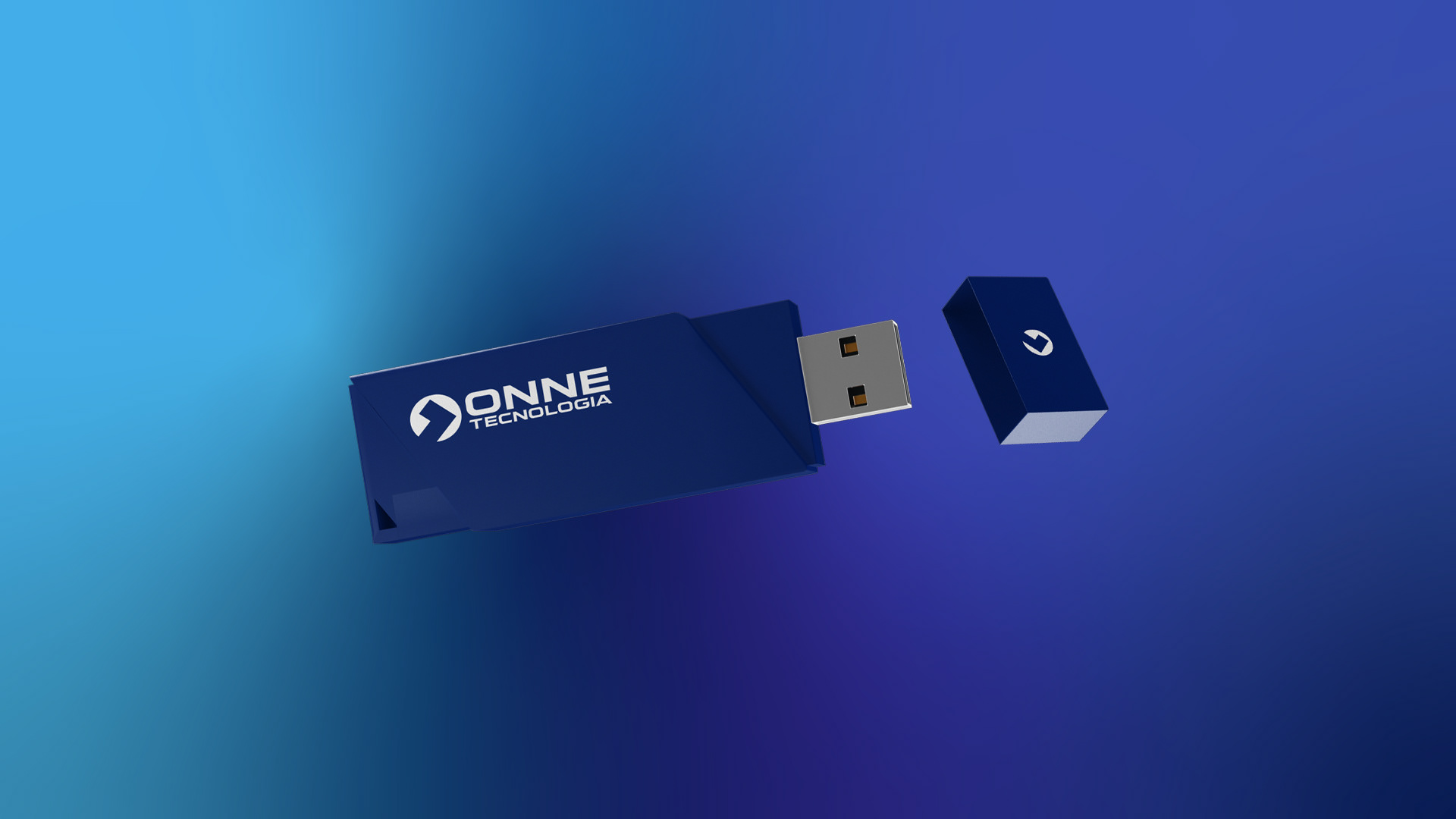
As cores trouxe uma potência a mais para marca, sendo induzidas pelo degrade de azul marinho até o roxo. No degradê feito exclusivo pra ONNE, fiz um foco central aceso, remetendo a tela de um computador. Trazendo uma modernidade e exclusividade para a marca.


EN
ONNE is a company from São Paulo that has been in the market for 20 years with its main focus being the provision of specialized IT (Information technology) services.
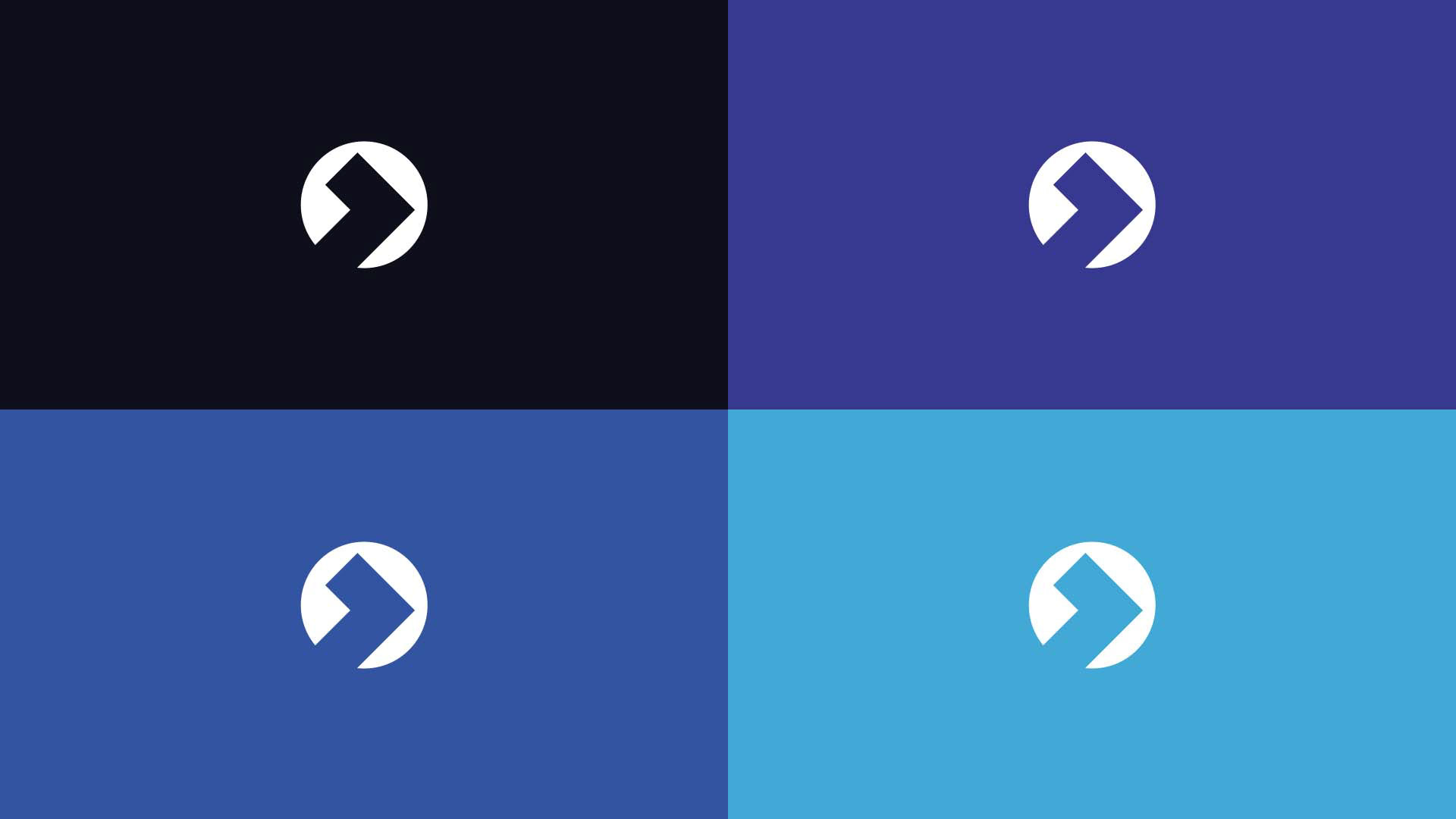
The new brand brings a reference of the identity, current, clearer with more strength and power in the colors, and in the name, with a more neutral typography optimized for reading.
The icon was thought of as an element of the programming language and at the same time the number 1 of ONNE (the element used was the ">" symbol that represents "greater than", bringing the meaning of the importance of security that the company has with its customers , who put them first and therefore are the greatest when it comes to service and delivery of work. An implant to remember that the more you need, the greater the support, being number 1 in service. A summary of how ONNE brings what customer needs, being good at what they do.
The colors brought more power to the brand, being induced by the gradient from navy blue to purple. In the gradient made exclusively for ONNE, I made a lit central focus, referring to a computer screen. Bringing a modernity and exclusivity to the brand.