
PT/BR
Gabrieli Furtado | Branding
Um logotipo em curvas, assim como um sorriso.
Essa é a identidade visual da Gabrieli Furtado, profissional da área de odontologia. Visando o novo conceito para sua marca, ela quis algo que a representasse e que trouxesse uma certa flexibilidade com um toque especial onde diferenciaria a sua logo das que já existem no mercado, sem sair muito do clichê.
Essa é a identidade visual da Gabrieli Furtado, profissional da área de odontologia. Visando o novo conceito para sua marca, ela quis algo que a representasse e que trouxesse uma certa flexibilidade com um toque especial onde diferenciaria a sua logo das que já existem no mercado, sem sair muito do clichê.
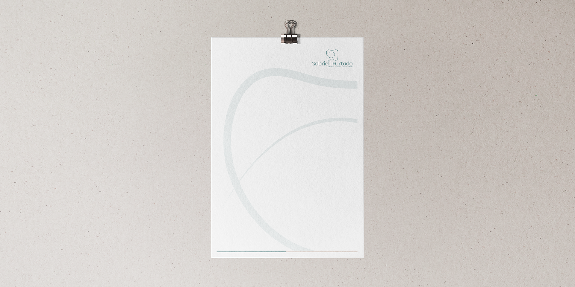
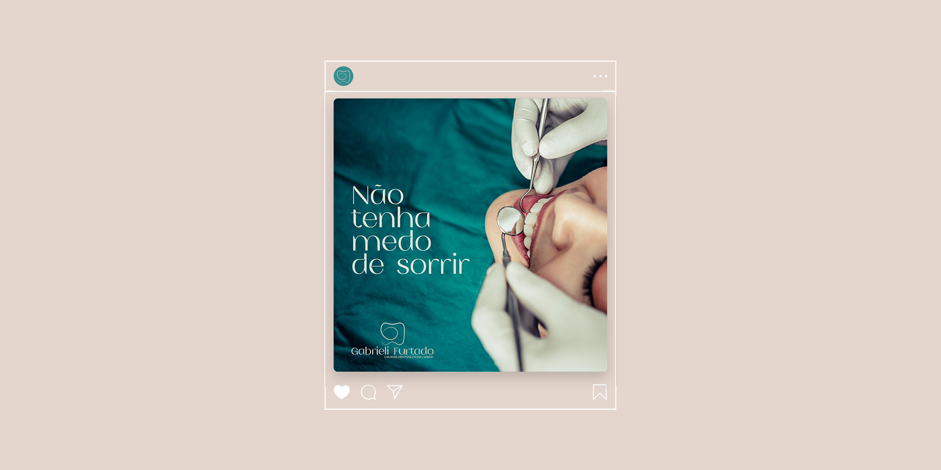
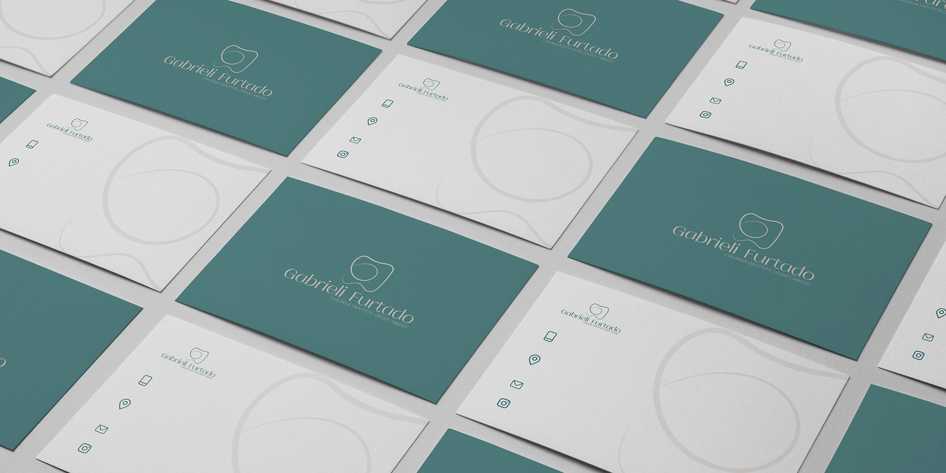
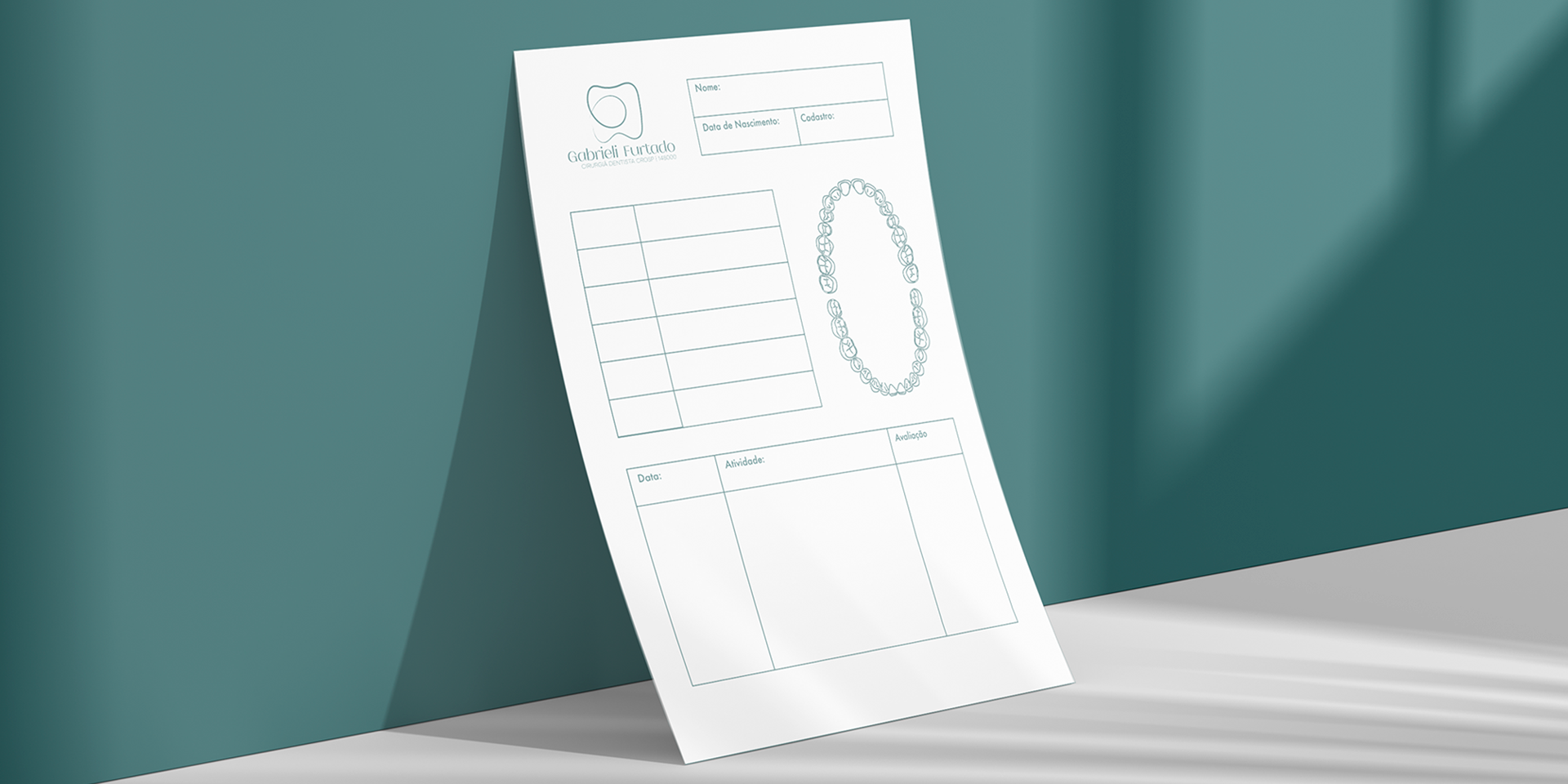
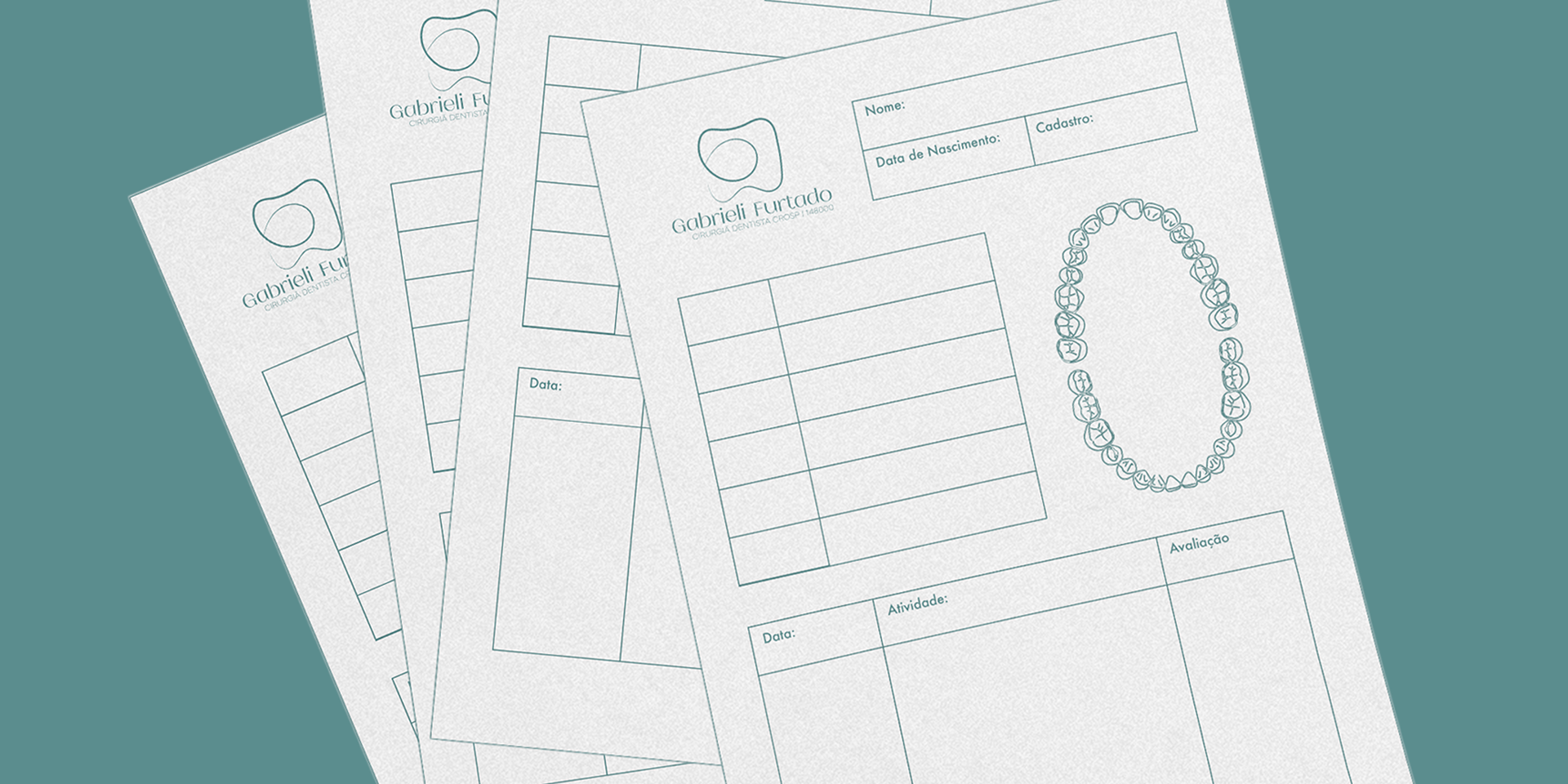
A logo se inicia com a primeira letra do seu nome, fazendo um contorno levando ao principal elemento, um dente. O vínculo com sua profissão é bem visível de forma clara e leve. A leveza que o logo traz foi proposital pela estratégia da marca. Allgo minimalista e sério para trazer confiança aos seus clientes.
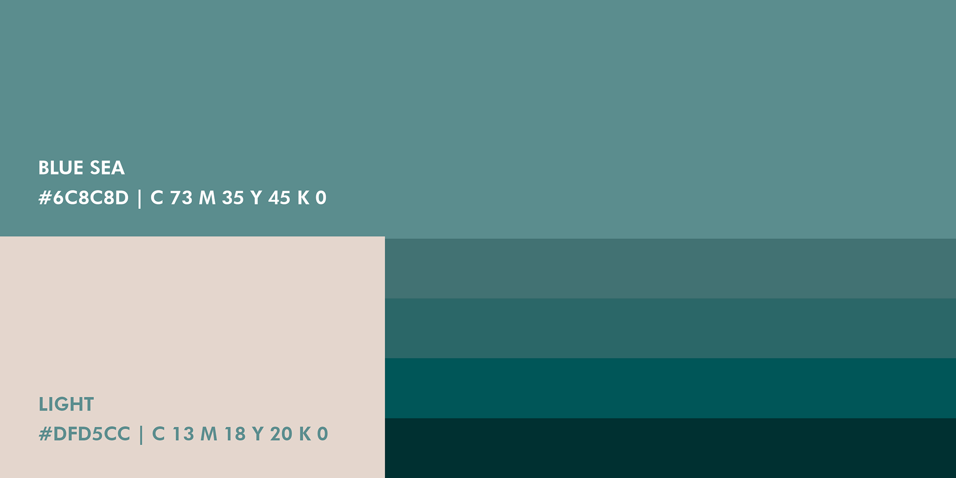
As cores neutras foram escolhidas para transmitir tranquilidade, pois a calma é maestria dessa profissão.
As cores neutras foram escolhidas para transmitir tranquilidade, pois a calma é maestria dessa profissão.


EN
Gabrieli Furtado | Branding
A logo in curves, as well as a smile.
This is the visual identity of Gabrieli Furtado, a dental surgeon. Aiming at the new concept for her brand, she wanted something that represented her and that brought a certain flexibility with a special touch where she would differentiate her logo from those that already exist in the market, without going too far from the cliché.
The logo starts with the first letter of its name, making an outline leading to the main element, a tooth. The link with your profession is clearly visible and light. The lightness that the logo brings was purposeful by the brand's strategy. Minimalist and serious to bring confidence to your customers.
Neutral colors were chosen to convey tranquility, as calm is the mastery of this profession.


Thank you for watching | Obrigado
Gustavo Messias