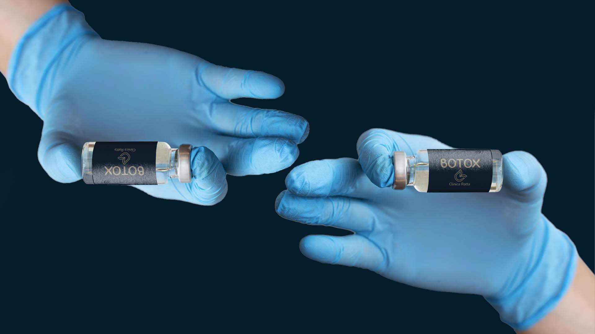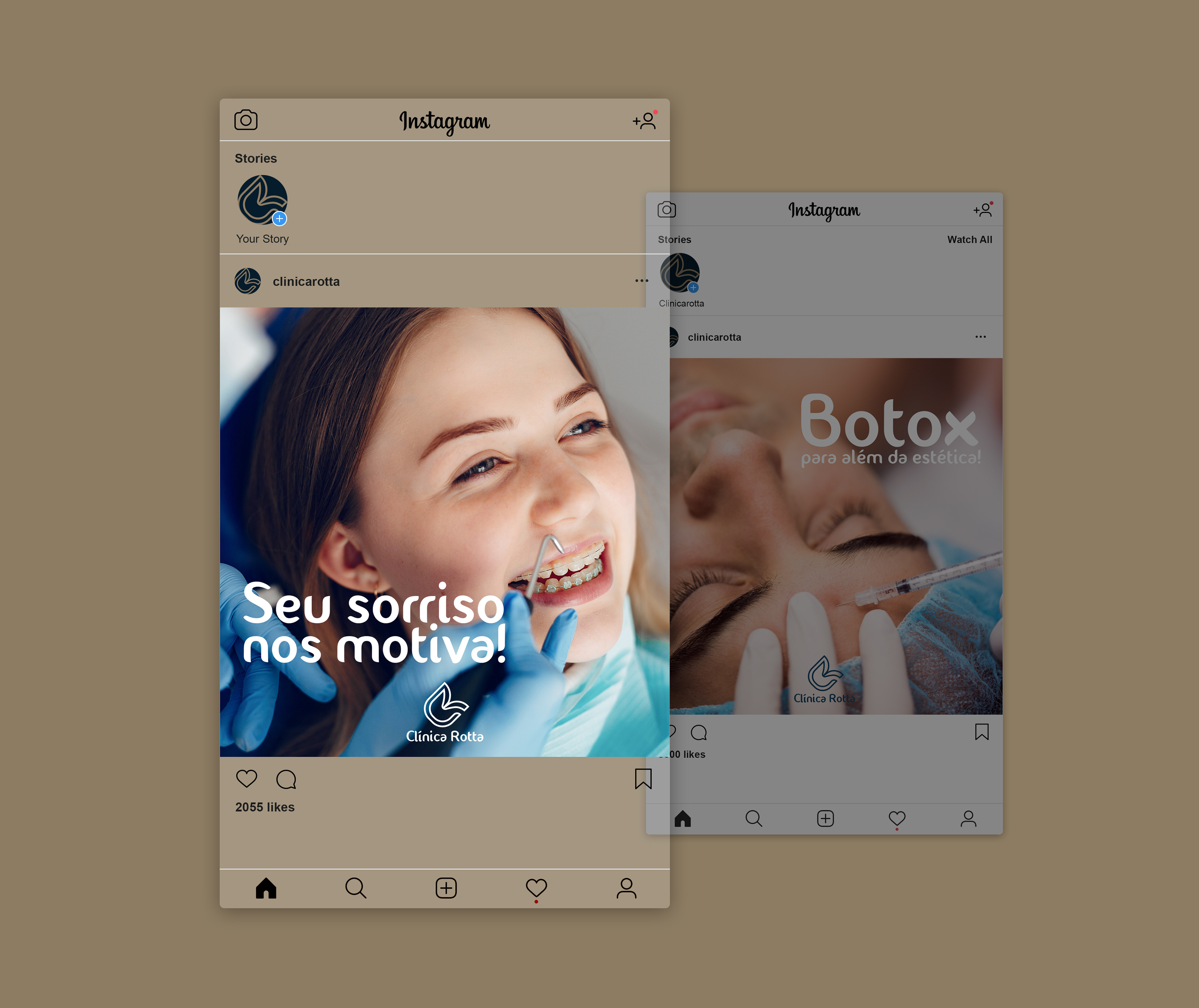
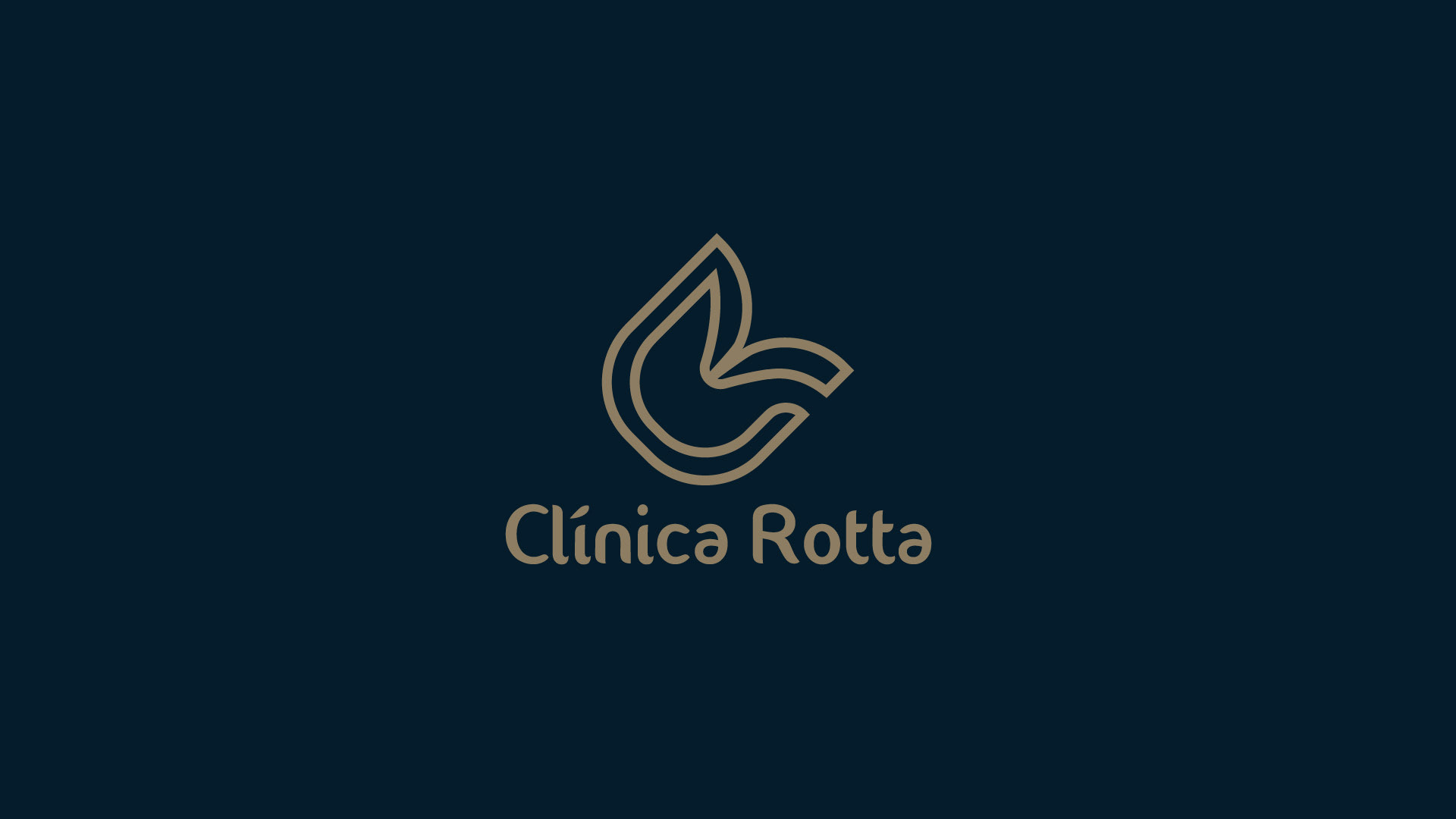
Clínica Rotta
O PROJETO
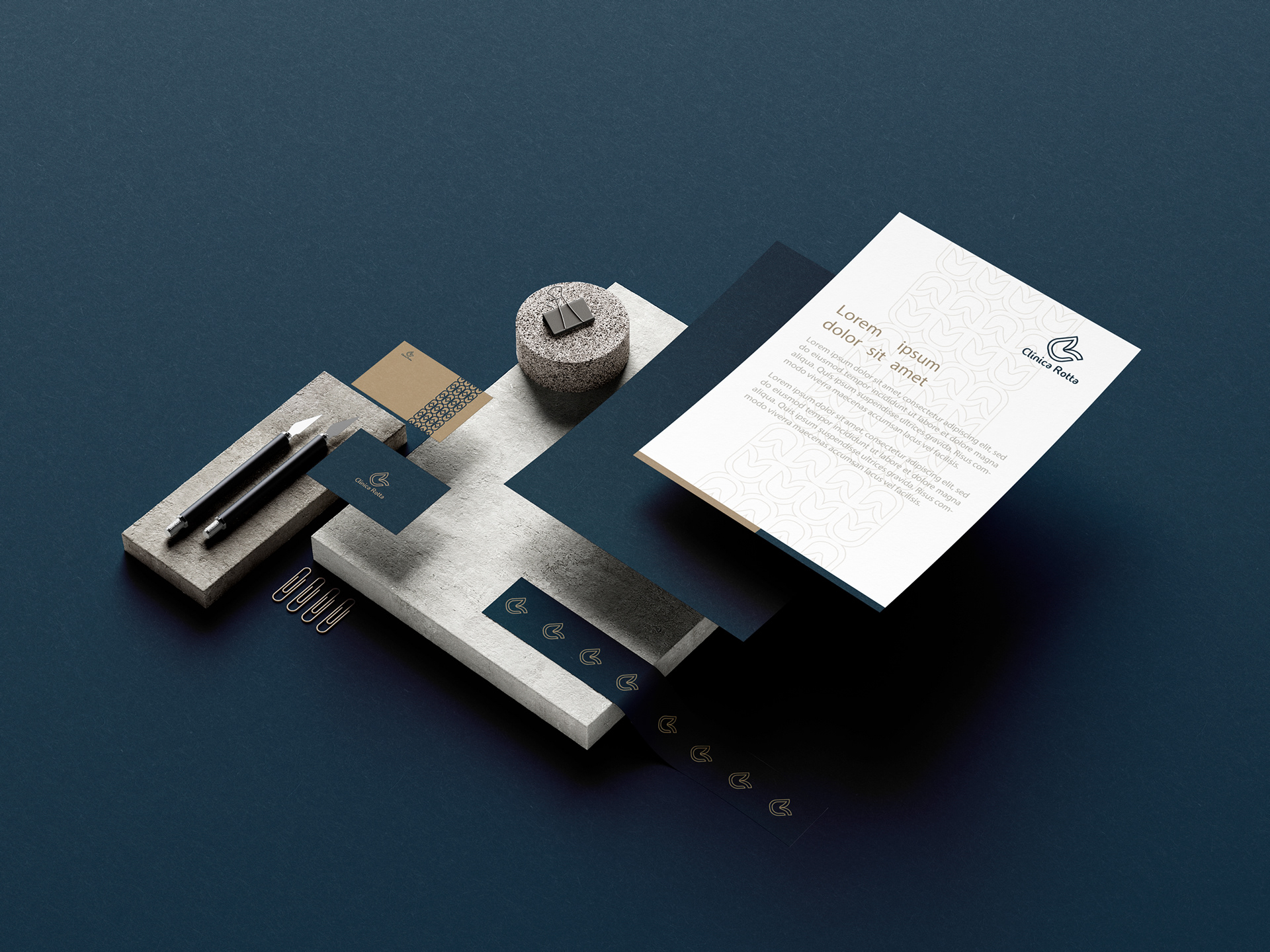
Um novo conceito e uma nova identidade simbólica para o seguimento de odontologia e estética, faz do novo logo de vocês, especial.
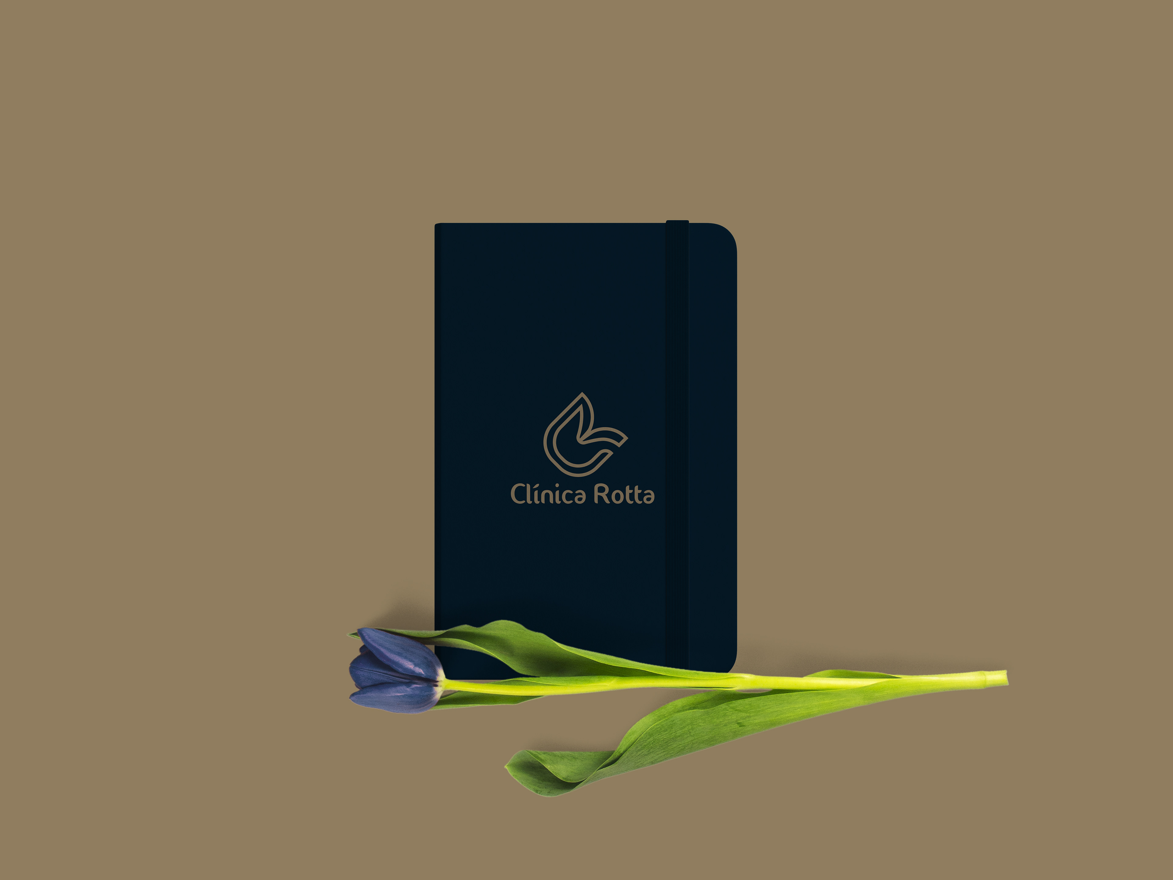
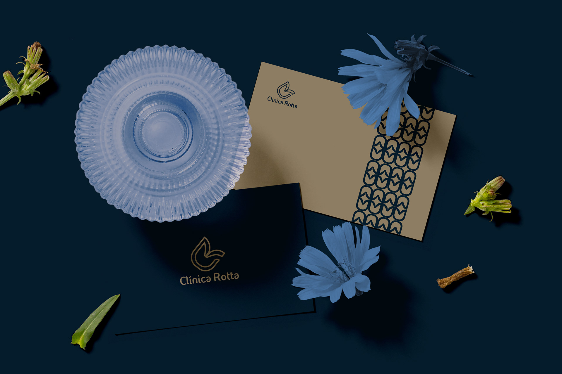
O logo da a referência a um dente relembrando a antiga identidade, e ao mesmo tempo, o formato da flor Tulipa que são representadas como ícones de beleza e sofisticação para representar a parte estética da clínica. As tulipas estão entre as flores mais conhecidas e admiradas no mundo todo, elas também reapresentam o amor, quis dar destaque para o amor pela profissão que vem de família.
A cor azul, vem com a definição de lealdade, confiança e tranquilidade, fazendo o logo bem representativo, tanto pela profissão, quanto pelo seguimento trabalhado. Em todos os aspectos o logo se complementa, começando com as inicias de Clínica Rotta (CR) direcionando elas para o ícone, junto com a definição das cores escolhidas. Isso faz do logo completo, original e expressivo.
EN
THE PROJECT
A new concept and a new continued identity for the continuation of dentistry and aesthetics, makes your new logo special.The logo is a reference to one of remembering the ancient flower at the same time, the shape of the Tulip flower, which are beauty's identity as icons of beauty and sophistication to represent the aesthetic part of the clinic. As tulips are among the best known and most admired in the world, they also represent love, I wanted to highlight the love for the profession that comes from family.
The blue color comes with the definition of fidelity, trust and tranquility, making the logo very representative, both for the profession and for the work done. In all aspects of the logo, Rotta complements itself with the initials of Clínica CR) directing to the icon, along with a definition of the chosen nuclei. This makes the logo complete, original and expressive.